


Attracting the best talent isn’t the easiest task these days. While there may be a larger pool of candidates to choose from, it’s much harder to get the candidates to look your way in a marketplace flooding with competent employers. To effectively be able to do so requires a) an understanding of what makes your candidates tick and b) the ability to smartly leverage that.
Career pages are one of the most significant touch points between the candidates and your company. They, therefore, ought to provide an experience that engages the candidate from the get-go.
Nowadays, one of the most important things to keep in mind when designing a career page that prioritizes the candidate experience is to keep it mobile friendly. This is a nod to the marked increase in smartphone usage in recent years. In fact, in the MENA region, the people having ownership of smartphones is soon to exceed 700 million.
This is certainly a powerful figure and points to an untapped opportunity for employers to boost their engagement with job seekers. We’ve rounded up some companies that have already done this, and how!
Here are some career pages that you could definitely use as reference points:
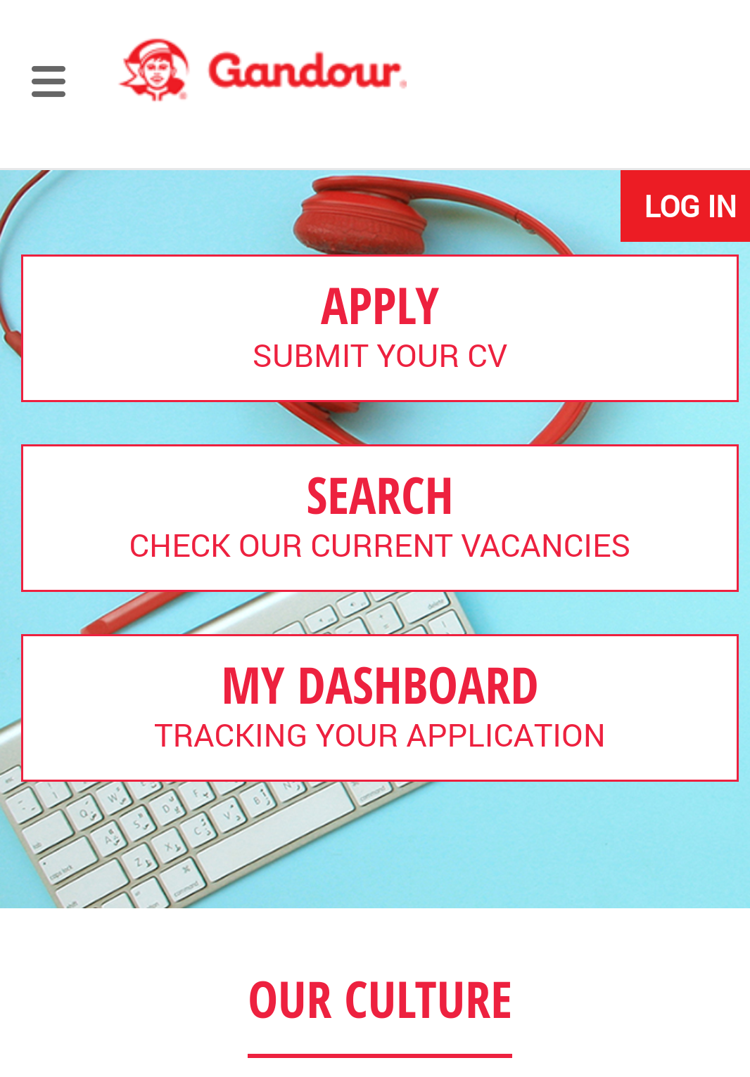
1. Gandour Mobile Career Page
Why it Works:
Gandour’s career page is a wonderful extension of the company itself.
The quirky color combination and candid photos of employees reflect its easy-going and fun-loving culture. The page places the various options available to the visitor at the very center, maximizing their visibility. Keeping in mind the limited screen space of mobile phones, the page doesn’t go overboard with its text or graphics. The text is well spaced out and very simple to read, while the use of images is minimal but impactful.

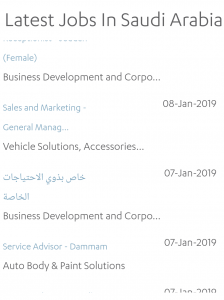
2. Abdul Latif Jameel Investments Mobile Career Page
Why it Works:
The background colors of the page are very soothing to the eye instead of being distracting or overwhelming. The Call to Action (find jobs, create a CV), is placed right at the top, optimizing its visibility.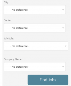
If you scroll down, you’re presented with an advanced job search option that allows you to filter out your job search based on city, role, company name etc. If you scroll further down, you’ll see a list of all the latest vacancies in the region, which is enough of a hook to encourage the determined job-seeker to keep exploring the site.
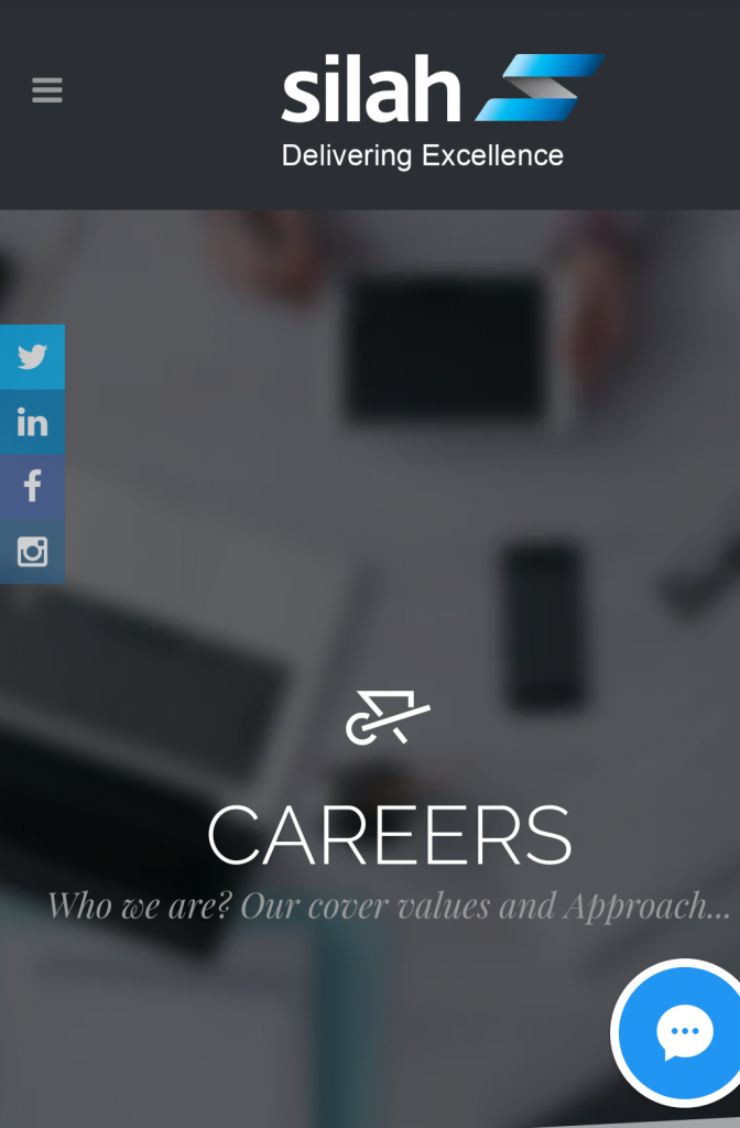
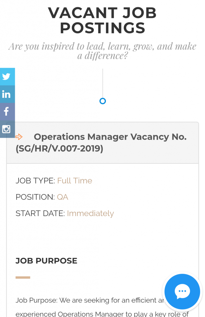
3. Silah Mobile Career Page
Why it Works:
This career page is the benchmark for good, mobile-friendly career pages! For starters, it has a cover video that offers a quick and exciting peek into the office space. There’s also a video testimonial of an employee – an excellent exercise in employee advocacy that also paints a vivid picture of the organization’s culture.

A small chatbot is also situated at the bottom to ensure that every query of the visitor gets an instant response.
Scrolling down, the page shows a list of job postings, accompanied by job descriptions and other details the job seeker’s always inquisitive about such as start date etc. This sure sounds like a lot of content to fit into one page, but a minimalistic design and well spaced out content doesn’t make it look overcrowded.
4. Dubai Islamic Bank Mobile Career Page
Why it Works:
As you open the page, you’re presented with a GIF that offers a panoramic view of the grand head office, standing in all its glory. This is an interesting idea to communicate the corporate spirit of the company.
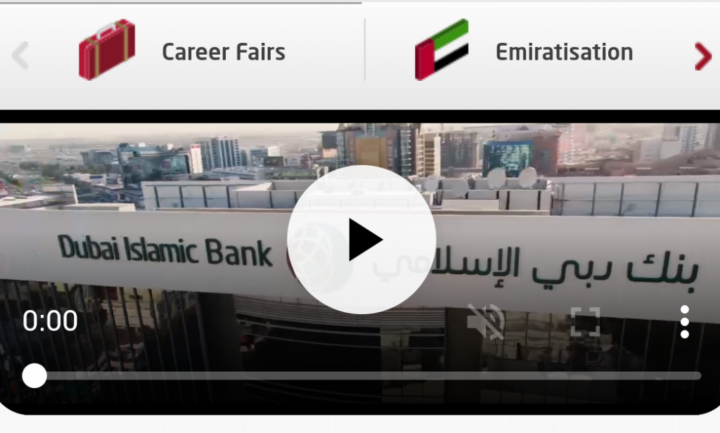
Brief but persuasive content, strategically placed CTAs, and concise descriptions of every department quickly provide the visitor with a company overview to supplement their job search. An eye catching chatbot feature is also included as a great customer support tool on the page.
Key Takeaways:
Interestingly you’ll see a running theme for all the selected career pages. We’ve listed down some features that they all have in common and which you must include when designing a mobile friendly career page.
· Strike the Right Balance Between Text and Graphics
Do not overcrowd the page with a lot of text or visuals. Cell phones have small screens which drastically affect readability. Keep your design minimalistic but classy, and your content informative but to the point.
· Strategically Place Your CTAs
![]() Be sure to include effective CTAS, and position them well to make them prominent.
Be sure to include effective CTAS, and position them well to make them prominent.
· Include Advanced Search Options
Ease the process for job seekers by simplifying your job search options. Allow them to filter their job search to keep it specific to their requirements and preferences. This will streamline their navigation and interaction with your page.
By creating a page that is adaptable to different formats, you’re essentially expanding the reach of your brand. Since many job seekers will be opening up your site from their phones, you want a page that offers a browsing experience primed equally for desktops and smartphones.
Your candidate is adding to their perception of your company every step of the way. By showing that you’ve taken their preferences into account, you’re getting the candidate on your side. It’s a classic case of little things leading to big results!
Before You Make Your Next Hiring Decision… Discover What Sets You Apart.
Subscribe to our newsletter to receive the latest Talentera content specialized in attracting top talent in critical sectors.